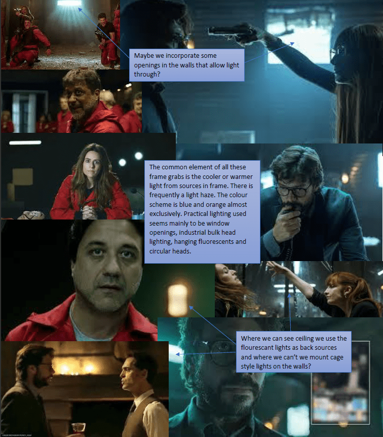
There are cinematographers who are known for a look – like Robert Richardson ASC uses hot spots of light or Vittorio Storaro ASC AIC is known for his scientific approach to the philosophies of use of colour.
Certainly Robert Richardson is inclined to use a high-contrast lighting style and indeed when I have lit using burnt out spots I have heard people on set saying ‘very Robert Richardson’ so we have to give him ownership of that. Vittorio Storaro’s psychology of colour thesis I suppose is less easy to immediately recognise on screen and if I’m honest with you it leaves me a little cold – or blue. I use colours when it feels right but for me it’s more of a visceral reaction to the location or action rather than a scientific approach.

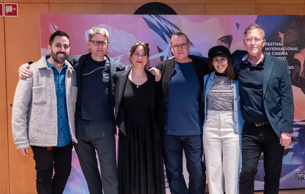
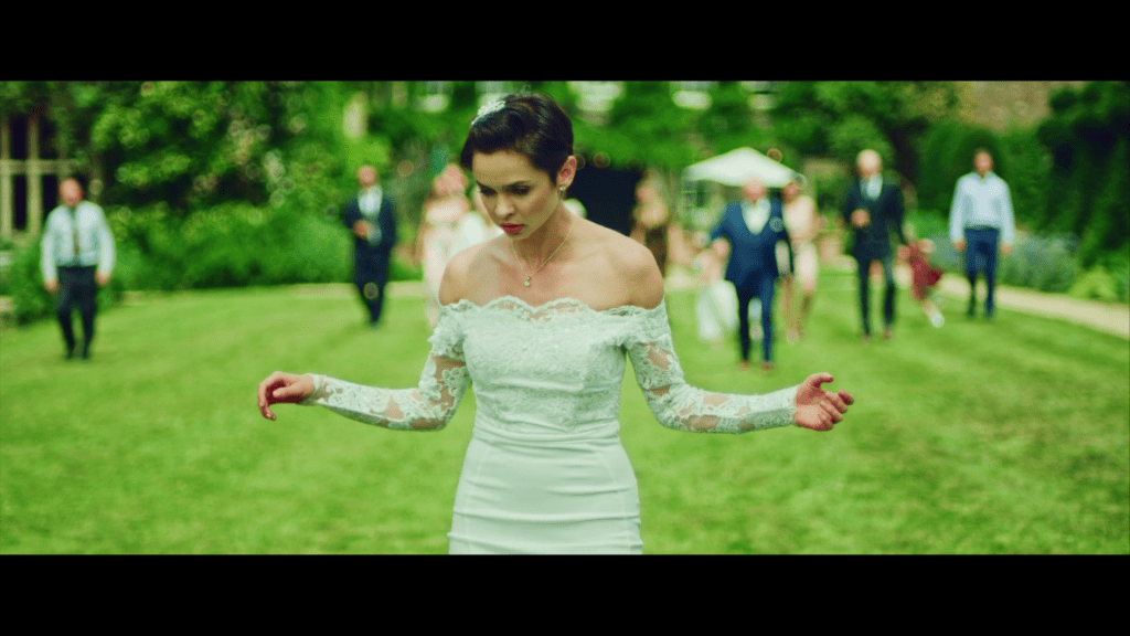
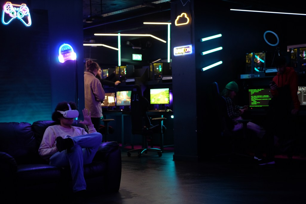
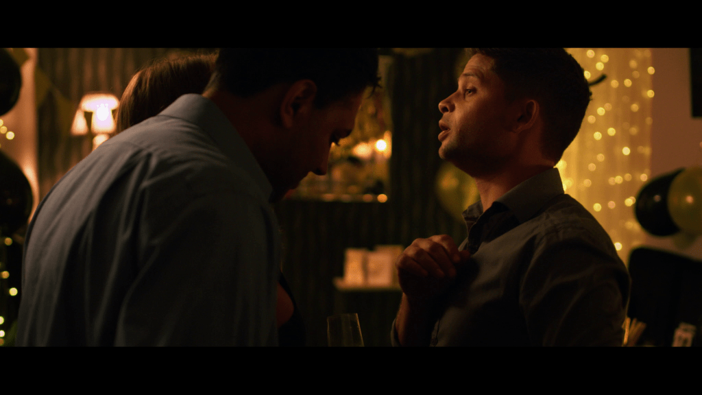
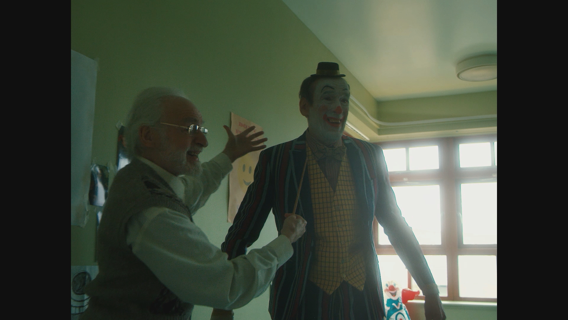
Recently I’ve been thinking about what is the evolution of a ‘look’ as the last film I shot is going around the festival circuit and at the time of writing has won two Best Cinematography awards (Fantasporto and Fantasia). It is my first film with director Alberto Sciamma (Killer Tongue/Jericho Mansions) and is called Cielo (Heaven). It’s a very beautiful film, and by that I mean everything: the script, direction, acting, art, costume, locations, music, sound design, editing, SFX, VFX – the lot! And it touches people in a meaningful way. Here is the trailer for it.
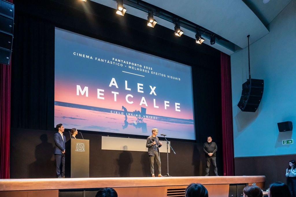
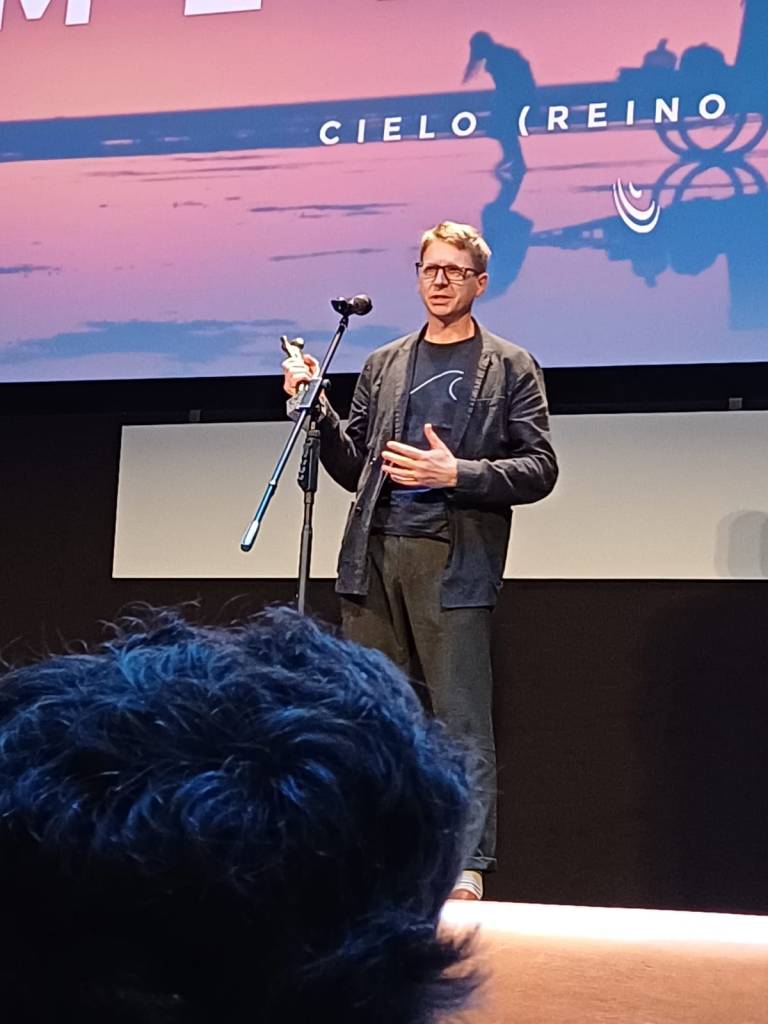
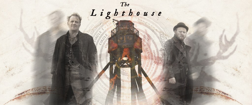
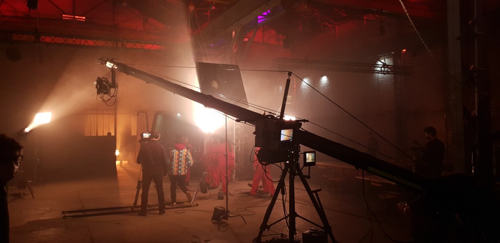
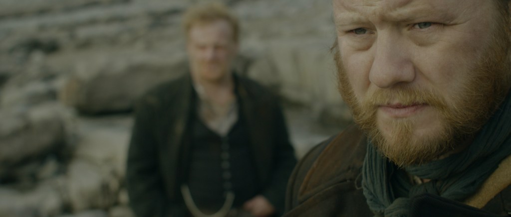
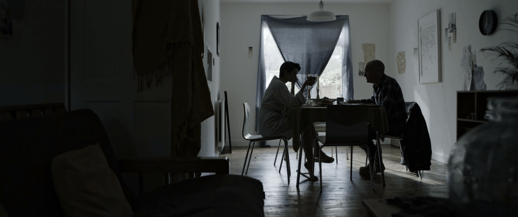
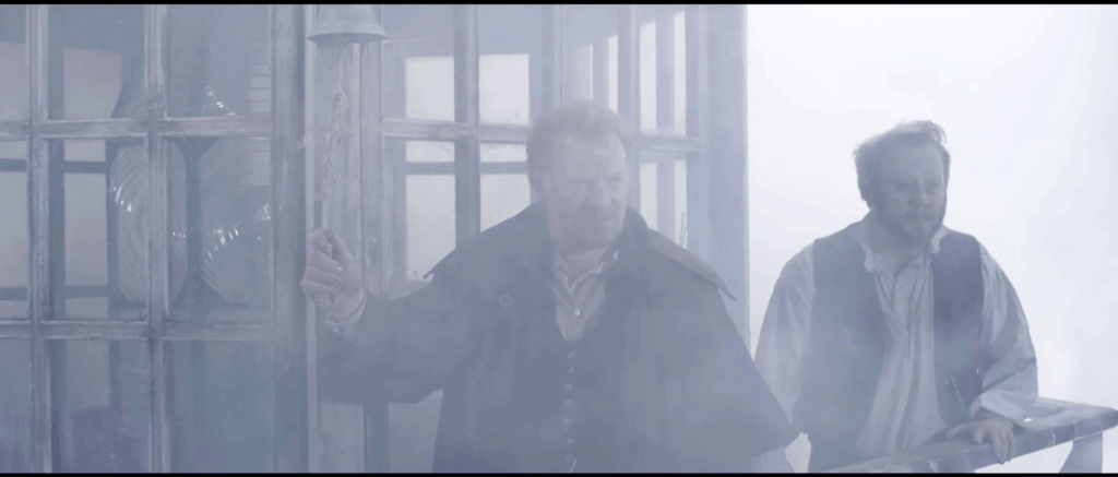
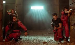
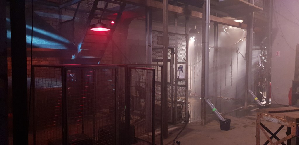
Collecting the awards was obviously a joy and nearly all the reviews mention the look of the film but what I want to explore is what creates that look? Is it my look? Should I be collecting the awards at all? If you look at some of my other films they look very different and so I find myself asking what are the constants, if any? What is my look? And how does it change with the influence of different directors and teams? I’ll spread this over a two-part blog. This part will break down the influences in Cielo as I’m keen to reflect on how the look developed. Part two, coming soon, will talk a little about the work I’ve done with director Chris Crow (Panic button/The Lighthouse) with whom I’ve made three films. Over those films we have found a visual thread that we are both drawn to. It is grimy, dark and messy. Whilst Cielo has those elements it is not how most people would describe the film visually so it seems worthwhile to dig into the genesis of those looks and see where we get to.
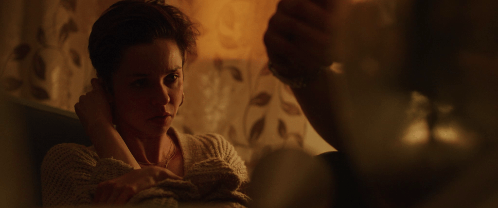
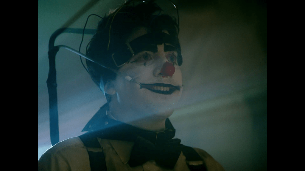
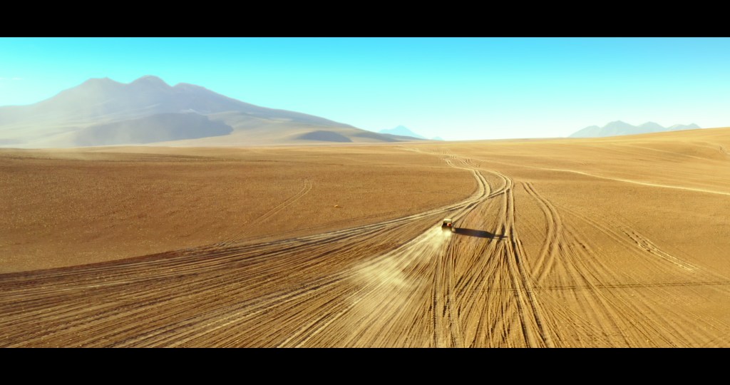
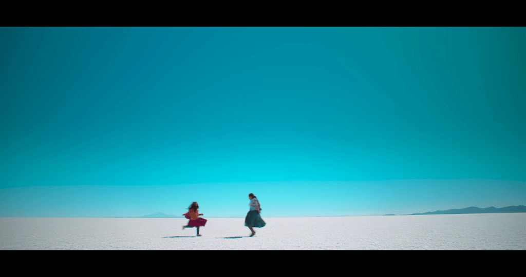
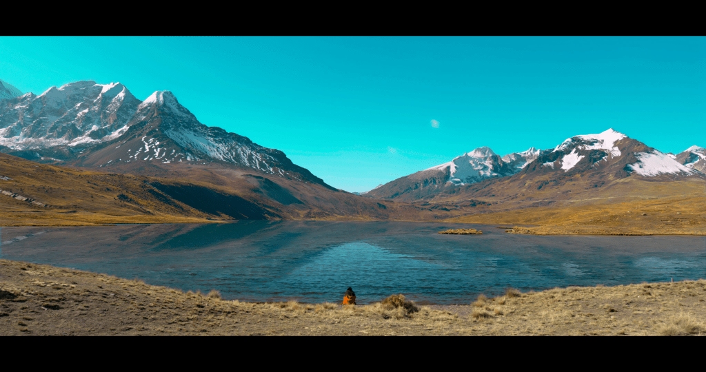
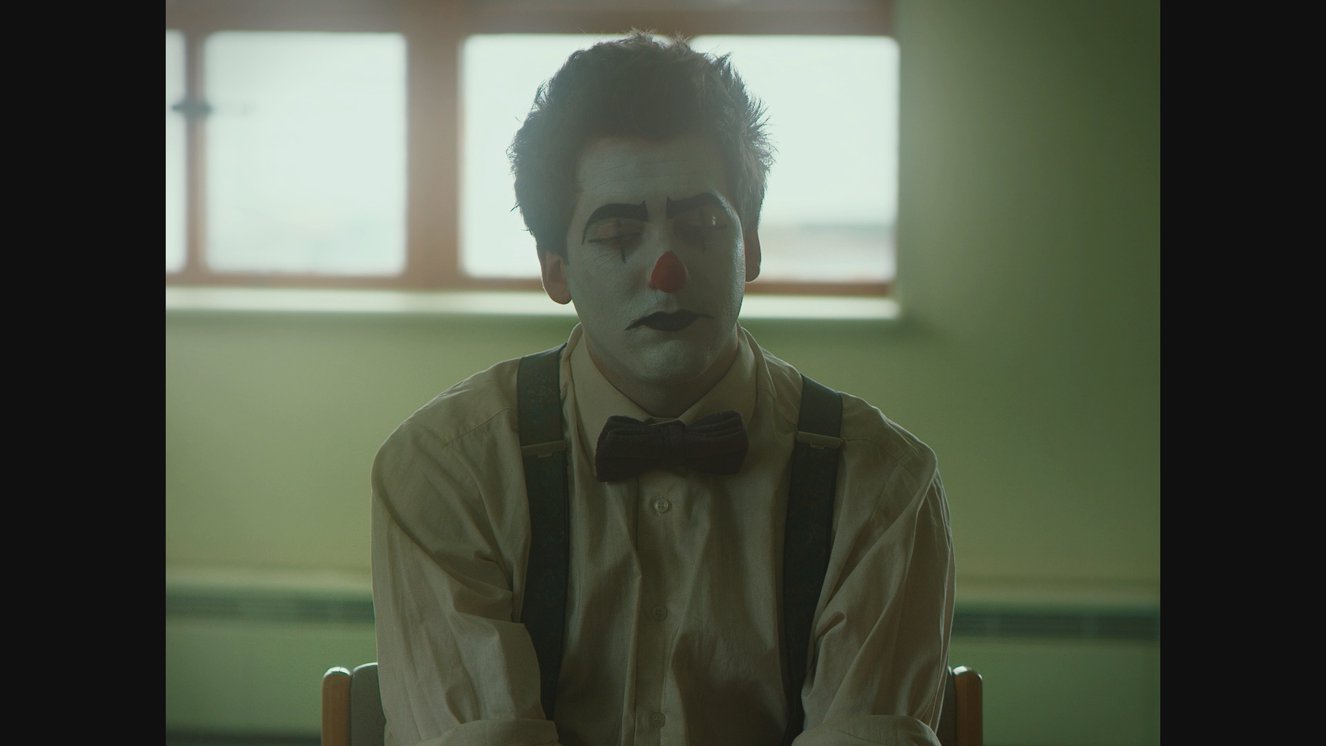
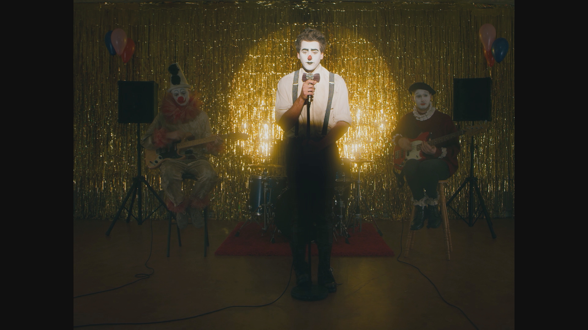
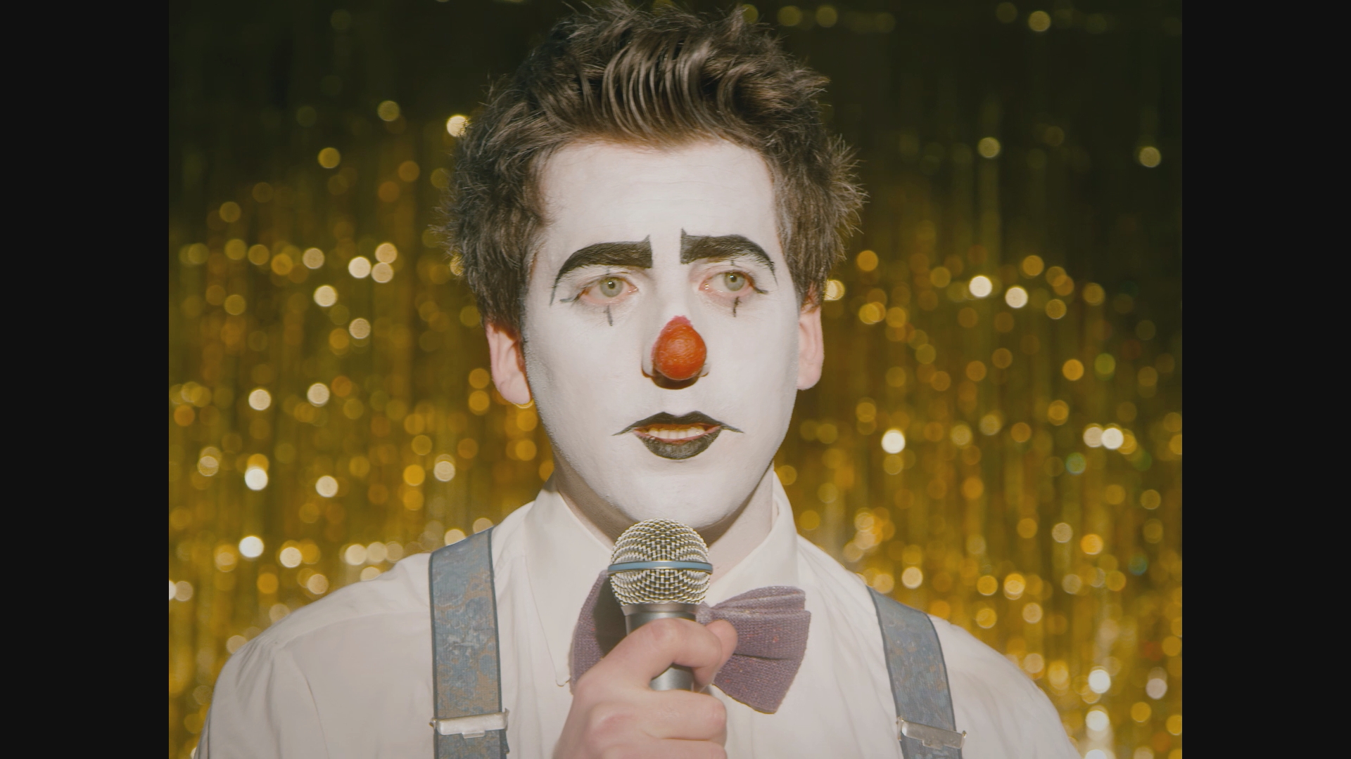
Cielo does have a very distinct look. It has a striking colour palette and a visual sense of purpose that very much charts the journey of our lead character ‘Santa’ (played by
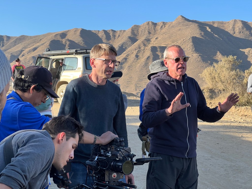
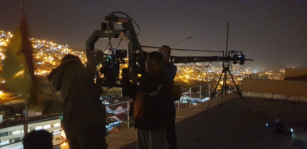
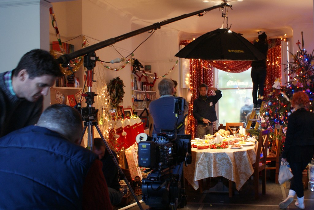
Fernanda Gutiérrez Aranda). The first thing to note is that Alberto and I had been working on Cielo for at least two years before the official prep period started. These talks ranged from practical requirements of the SFX and VFX with the department heads, Rob Goldstone and Alan Tabrett, to a much more esoteric understanding of how Santa would experience her momentous journey. Each conversation gradually connected Alberto and I on a common understanding of guiding principles and I suppose that is always the starting point of a look for me – to digest and respond to the director’s vision of the film
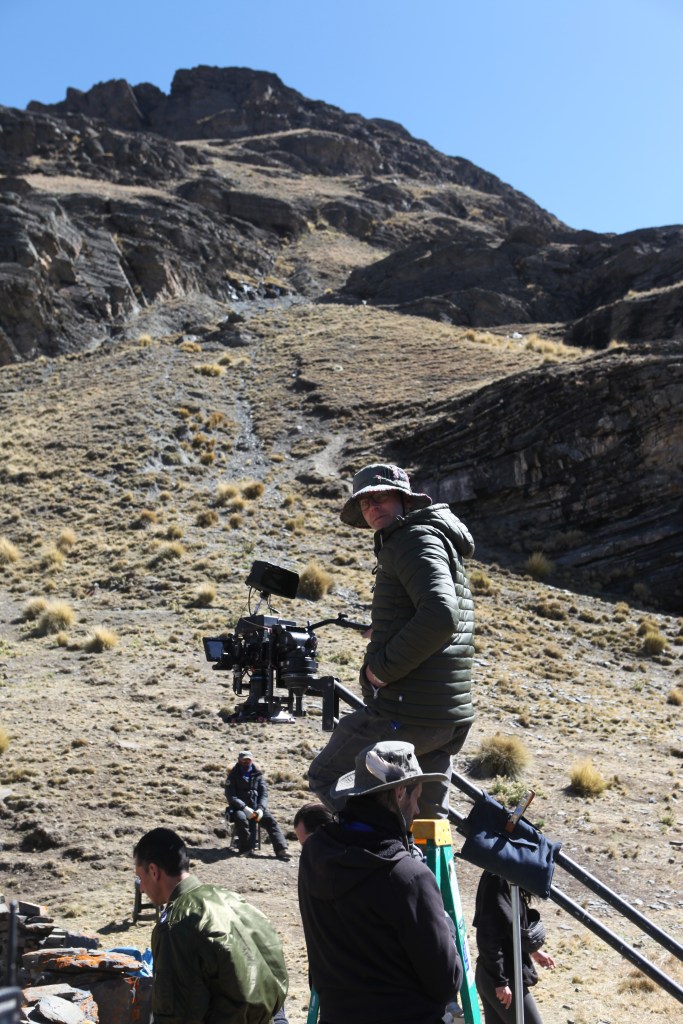
So before we headed to Bolivia to start the prep I had these ‘rules’ in my look-book:
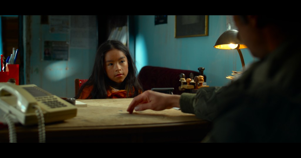
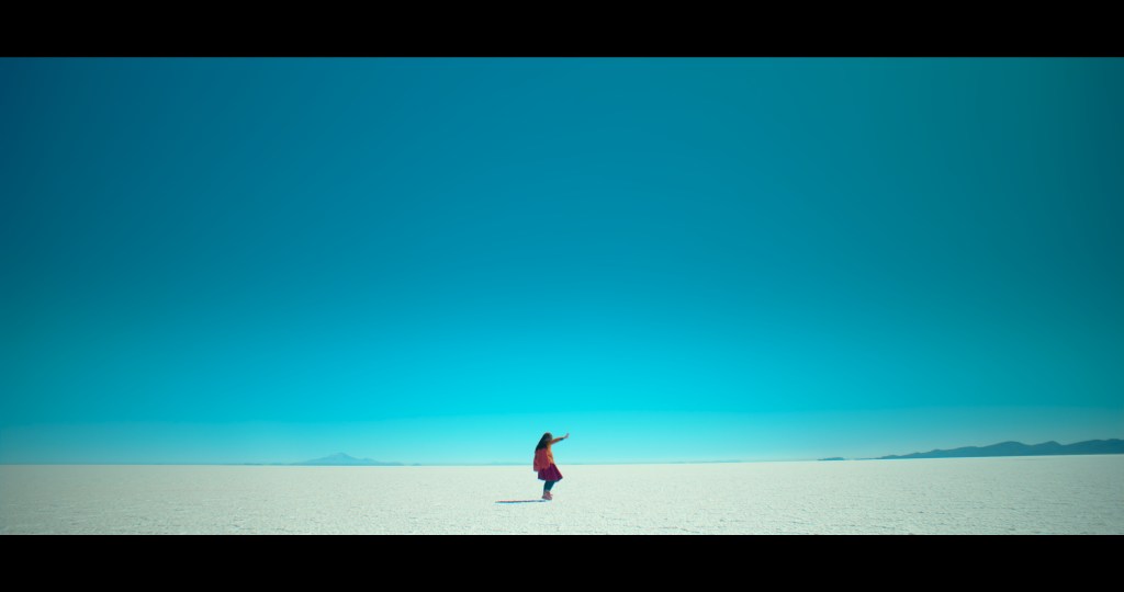
- It’s always about Santa and her journey. Camera height should favour her point of view.
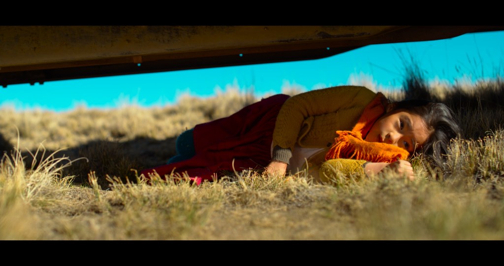
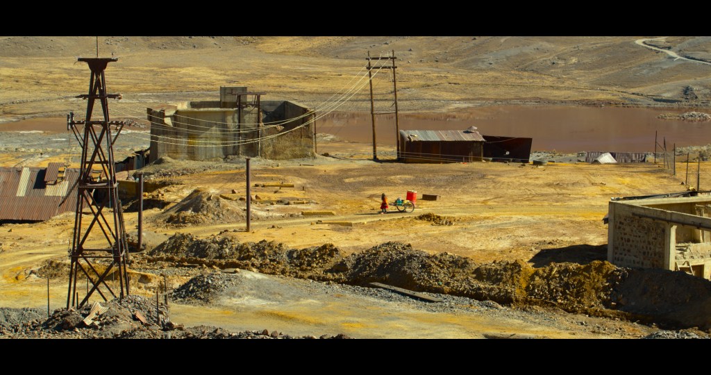
- The environment is another character. This is also the first time that Santa will have seen this environment and we should reflect her awe and her fears.
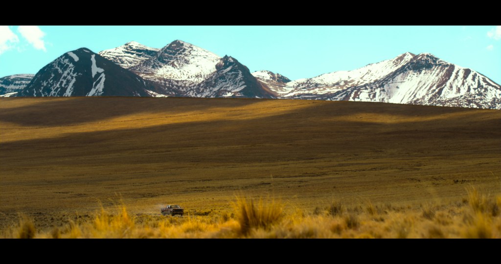
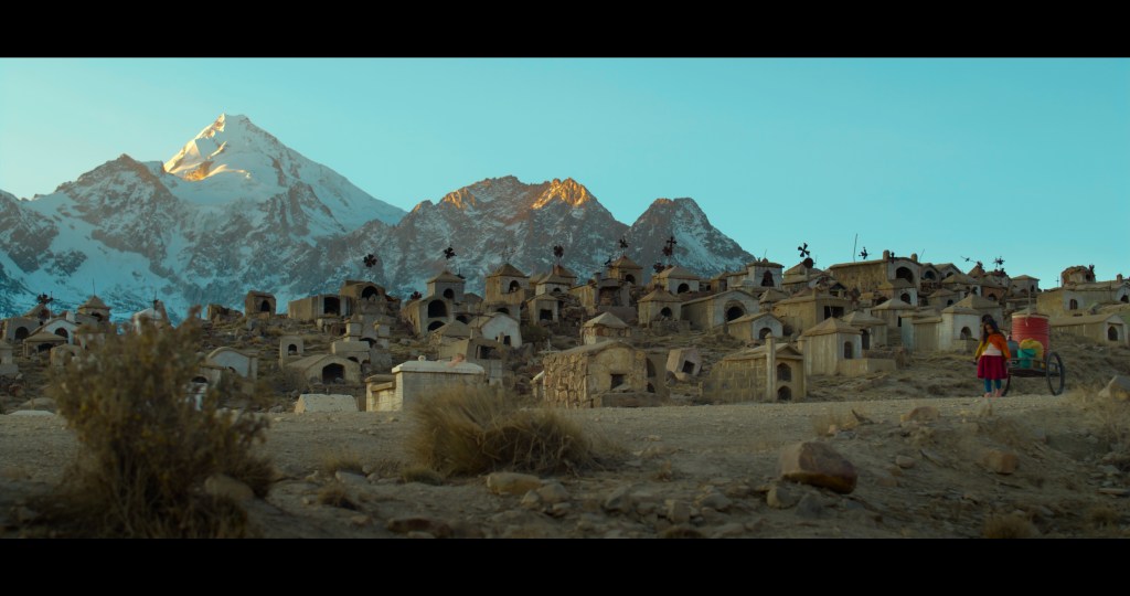
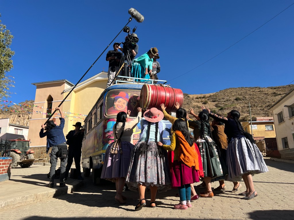
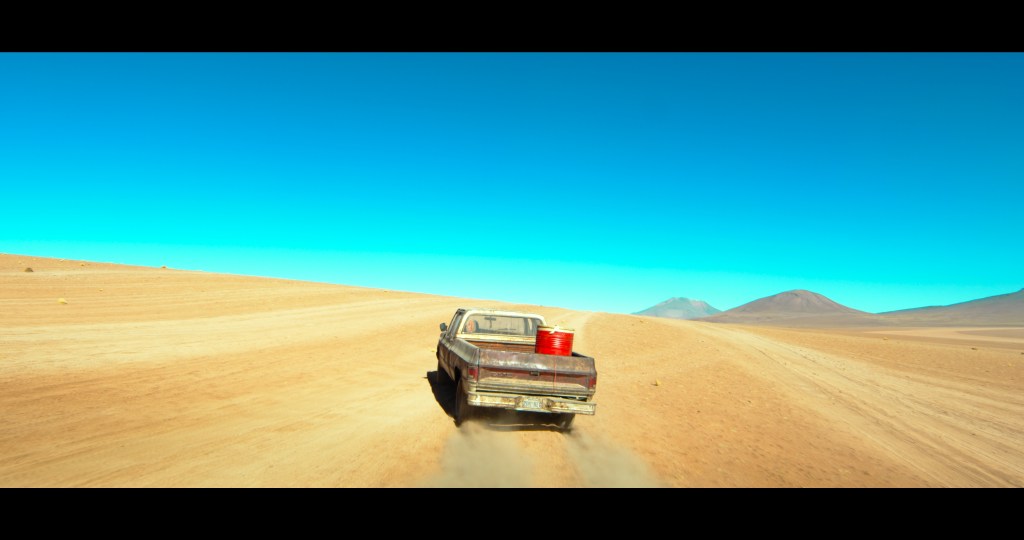
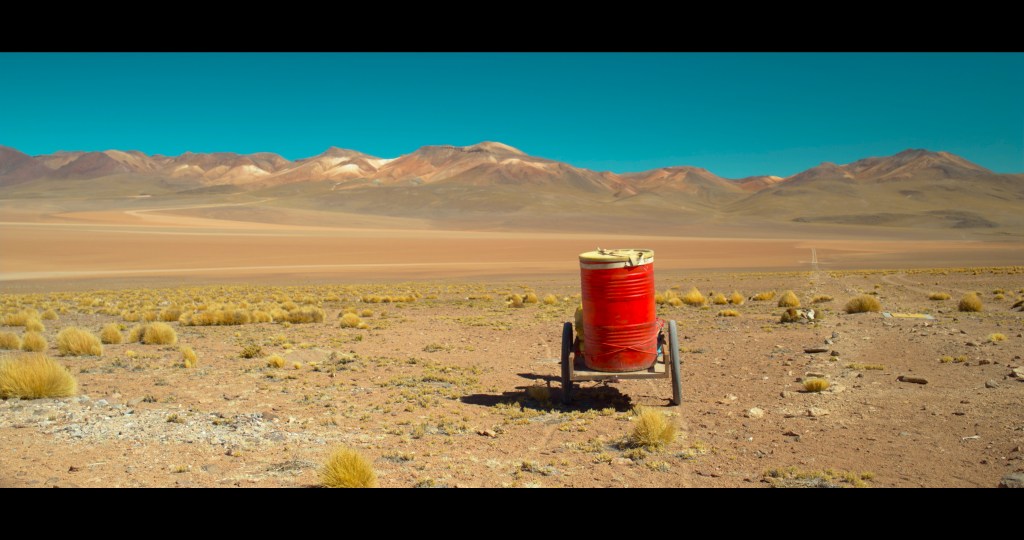
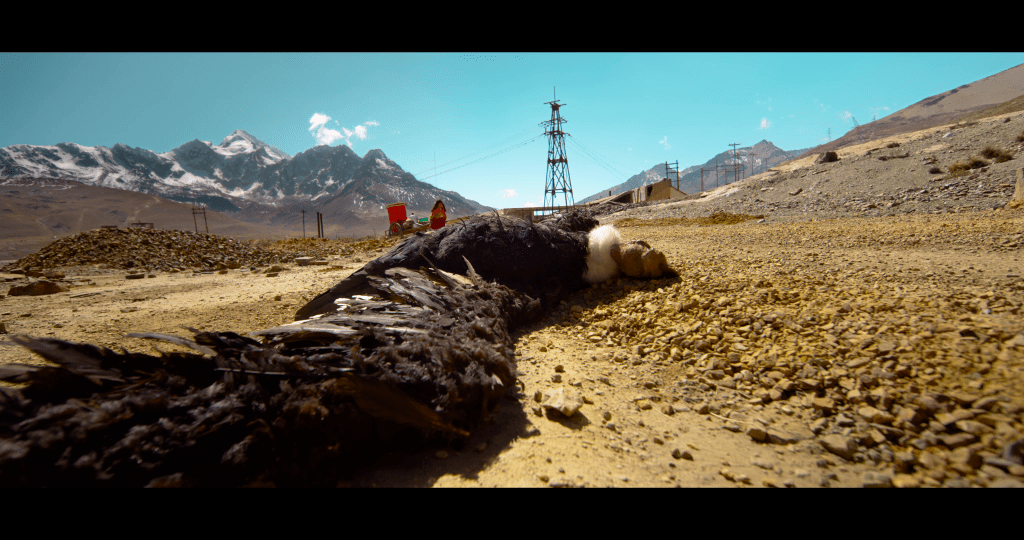
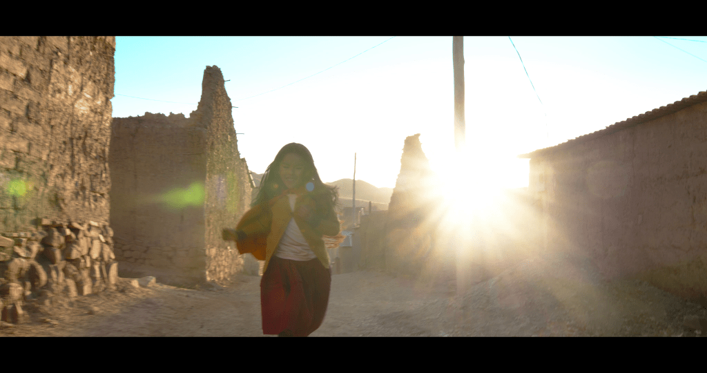
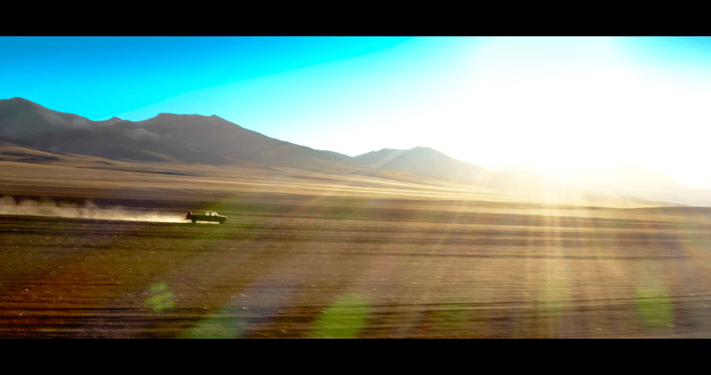
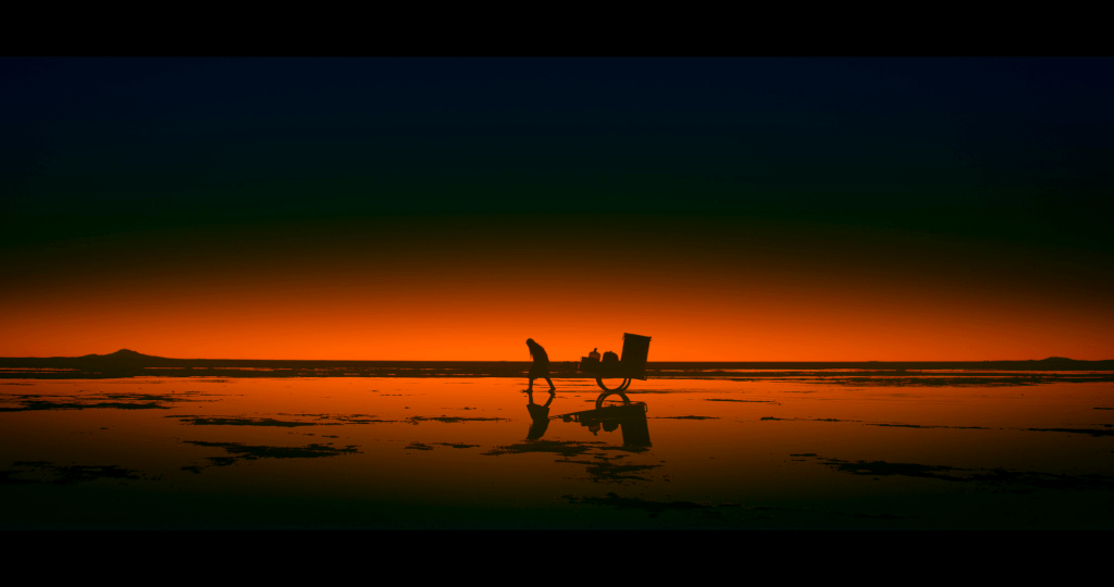
- The colour palette will reflect the yellows, blues and whites of the countryside. The barrel will be primary red as both complementary and contrasting.
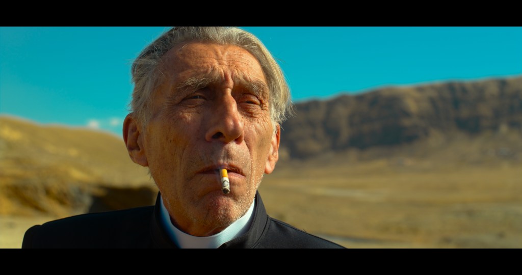
- We need to see the actors’ eyes. No hard shadows sending them into darkness.
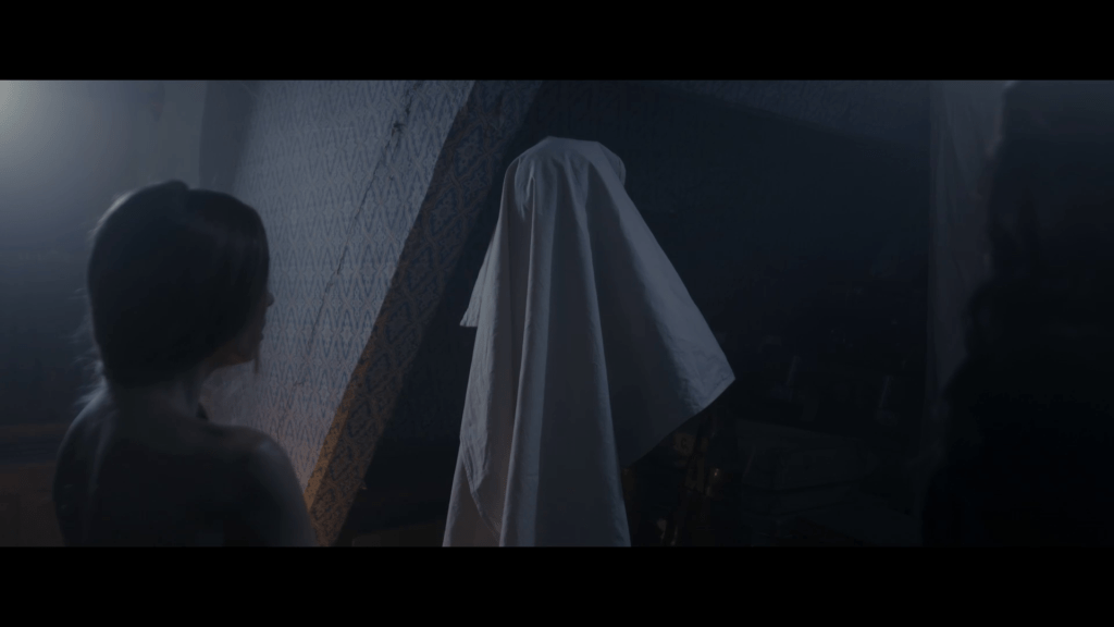
- The magical realism the film depicts needs to be created ‘in-camera’ as a priority and enhanced in post when required.
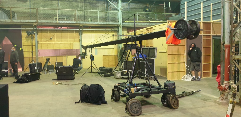
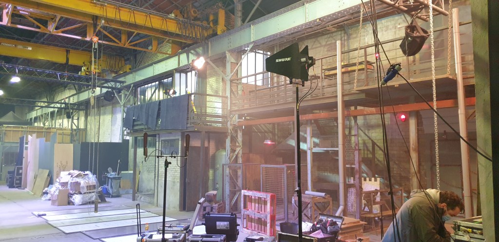
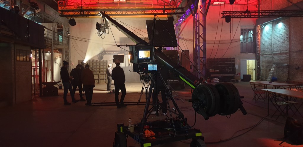
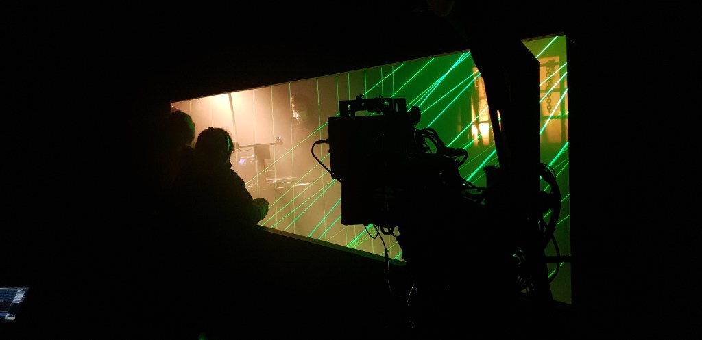
And to be honest this is the foundation of the look which I can definitely not claim ownership of. Alberto would have shared similar goals with all the department heads. I think for me as a cinematographer it’s essential to get to this level of understanding and to know that all the other department heads are working on a common look. What follows from this point is how I run with it, what I put in place to not just achieve it, but to build on it, to reinforce and grow it, and I guess, how to implement it. Some things are just small moments that ‘feel right’ like the heat haze from the clip below. This is a transition shot that joins the first and second scenes and the audience have just witnessed an unusual event. The idea of the heat haze came after we had scouted the locations and was very much an emotional reaction to being in those spaces. It would have been ok without the heat haze but for me the shot is transformed with it. It was created by a heated metal plate that the SFX team put in front of the lens just out of shot.
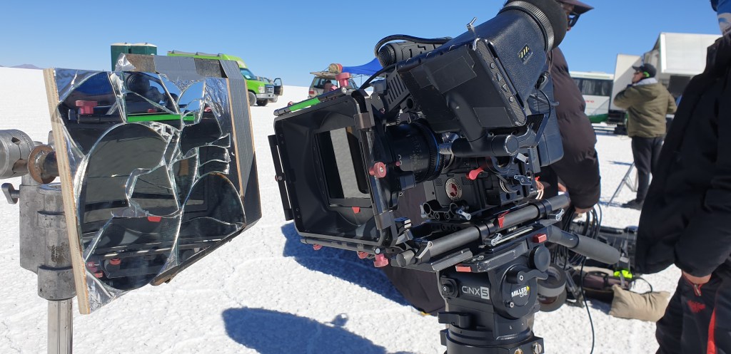
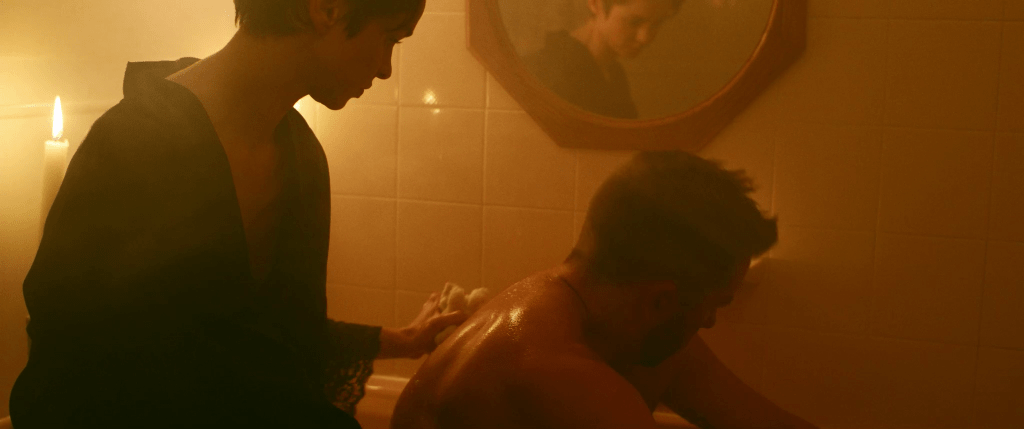
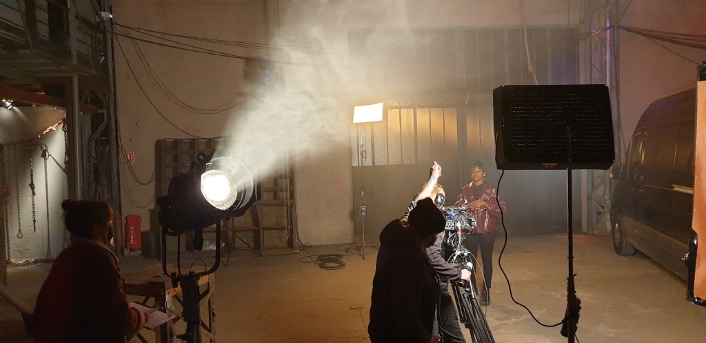
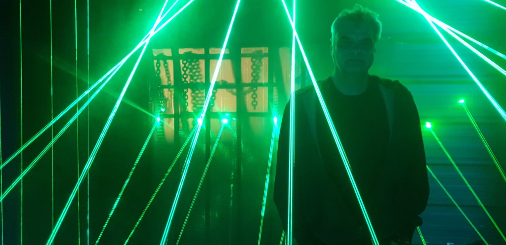
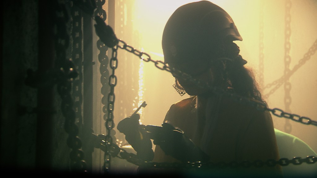
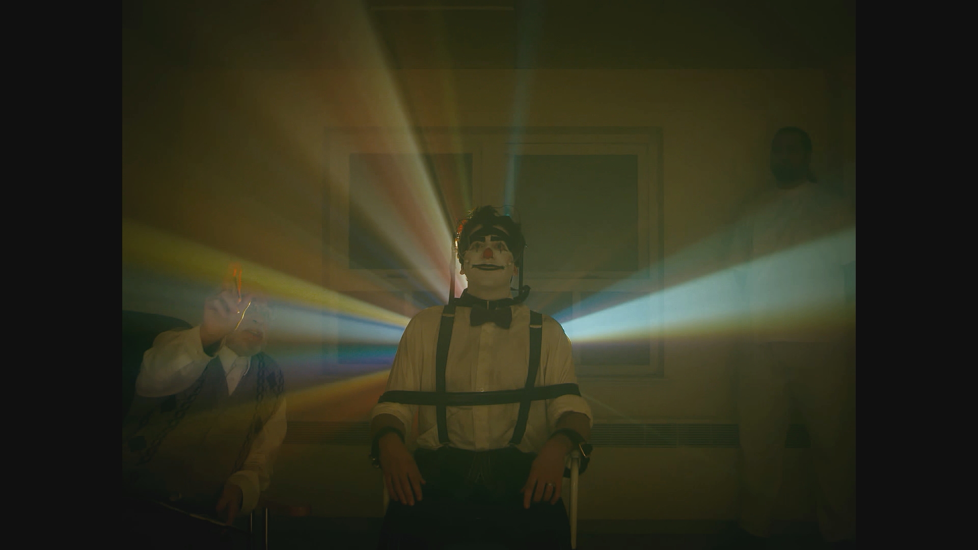
Some responses to the look-book rules were considered well before seeing the locations but were often tweaked on set. This is especially so with the in-camera SFX requirement. We knew we wanted to create flares to cover some of Santa’s more mystical moments and these were generally created with mirrors reflecting a bright source into the lens. We used mirrors so that we could easily manipulate the flare to come and go on demand. However we also used multiple things in shot to block and reveal flares; the cast, doors, windows – pretty much anything that could be moved! Below is a montage of some of the flare moments that blurred the audience’s understanding of what is real. For me there is a real beauty to these time-honoured and very simple solutions. Towards the end of the montage is a key scene where Gustavo (Fernando Arze Echalar) and Santa share a moment and I couldn’t imagine this scene now without the heavy flaring, especially the moment when Santa opens a door that floods light down the lens. This was substantially more extreme than I had expected but Alberto nodded his approval so we went with it, enjoying the lucky accident.
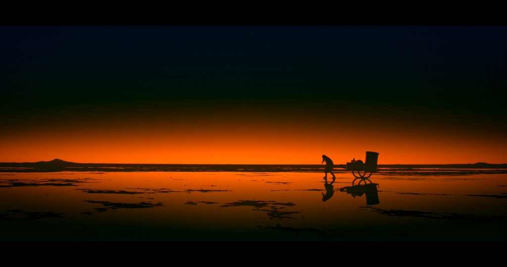
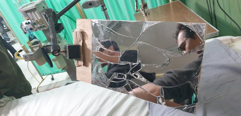
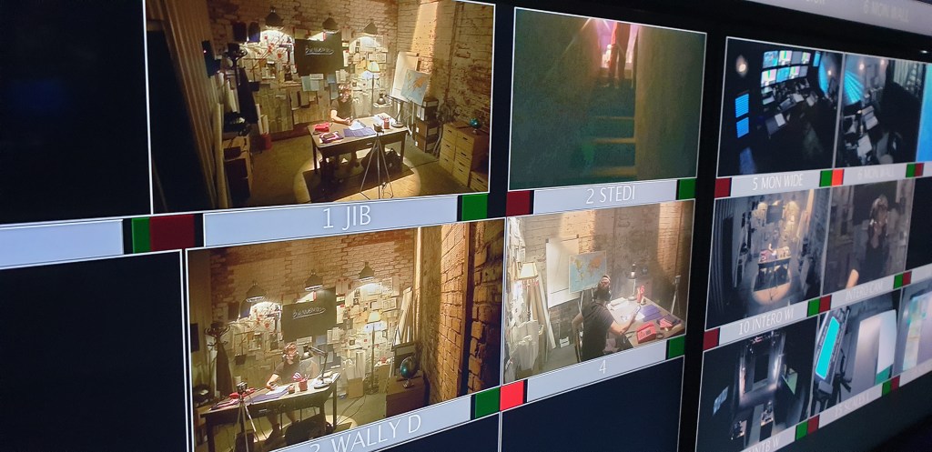
We also wanted to create an understanding that sometimes Santa was straddling two worlds. Finding a visual pathway to this was slow as so many solutions just felt like a low-fi video effect. We finally found a solution that felt organic, could be manipulated on set and didn’t dominate the moment. This was a set of broken mirrors that I glued onto a board at different angles. One board was made of a standard 1x broken mirror, the more extreme version was a combination of standard 1x mirror and 2 x magnification mirror (like the ones used for shaving). We then filmed the reflection of the action, rather than the action itself, opening to a stop of T2 to blur the joins in the mirrors.
But getting that look was a process. Alberto and I could say that we instinctively knew that this gave the visual feeling we were after, but it took a lot of seeing what we didn’t want before knowing that this is what we did want! And still it ended up not working for some sections that we had expected to use it on. For instance, there is a section where we wanted to visually link Santa on the salt lakes with Santa in the bus. So for that scene there were effectively two Santas and it was a moment where using the broken mirrors was believed to be correct. However both Alberto and I in our hearts felt it wasn’t quite right and we discussed it nearly every day that we were in Bolivia. This continued until the day we were shooting the salt lake element where we just tried a number of strategies until something clicked – Yes I can hear all the 1st Assistant Directors out there taking a collective in-breath of despair as time ticked by! But it was an interesting moment as the look-rules stated one plan but ultimately you have to allow the space to trust instinct over rules, ensuring the look to be a living and breathing thing. However, annoyingly, the look also needs consistency. Surely a look can only be a look if there are common threads running throughout the film? Overwise, visually, it’s just a series of scenes! For me this means consistency of some of the basics. In Cielo they were elements like frame size (predominantly very wide or close without so many mid-shots), shooting stop (T2.8 – 4), camera height (mainly Santa eyeline) and colour palette.
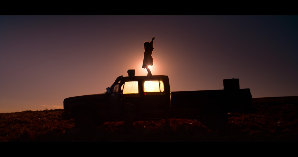
But as the saying goes, rules are there to be broken. And that comes with trust. The more we trusted each other and the look-rules, the more we were able to make bolder choices. There is a scene when Santa and La Reina (Mariela Salaverry) start to build their relationship. We were shooting it at dusk outside of a small restaurant in the mountains. The plan was to create the feeling that the sun had just gone down as the following scene in the film was the bus at night. We started setting up the scene and the sun was streaming in over the top of a mountain range. I worked out we probably had about 20 minutes of sun left and it looked so beautiful and would flare like mad which of course would fit with our visual themes. I asked Alberto what he thought and said if we shoot this right now we have 20 minutes to complete the scene. He saw the first frame and we went with the flaring option and it’s a lovely moment. I think had we been faced with this decision in the first week of shooting we would have waited for dusk which would have worked well still but not been anywhere near as impactful as the scene ended up being. Here it is.
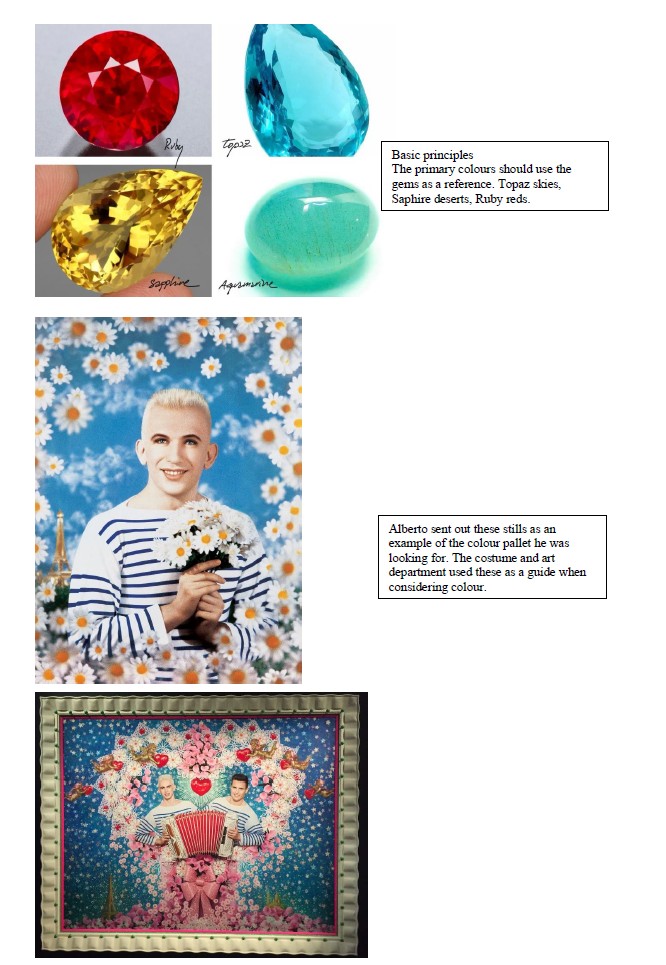
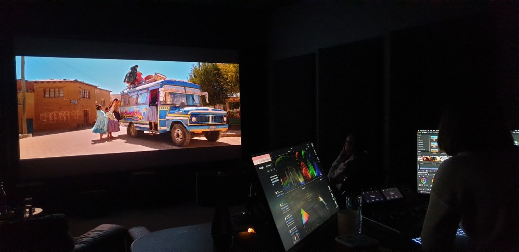
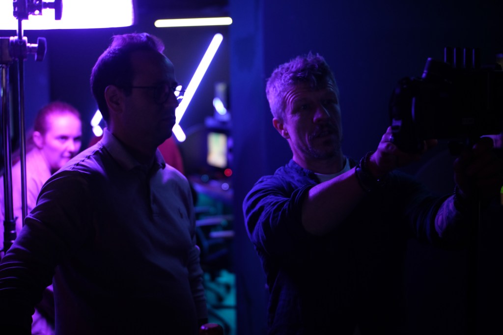
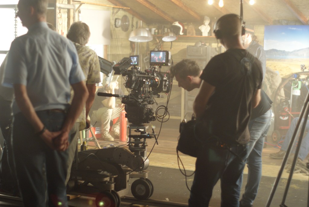
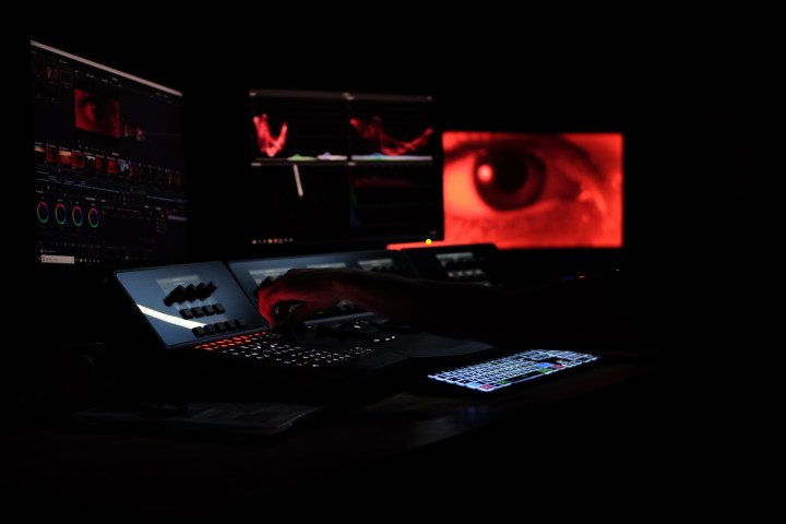
The final stage of the ‘look’ is of course the grade, the moment where you choose how strong the look should be. We graded at Onsight with a fabulous colourist called Emily Russul Saib. I did some test grades on frame-grabs at home and Alberto sent through his inspiration that came in the form of gem stones and then we sat down for 2 weeks to fight it out! Complete confession here – the end grade is more extreme than I had ever imagined. Alberto pushed it further than I expected and Emily took those themes and pushed them again. Naturally as I saw the scenes develop I was like the recently converted and jumped in with both feet but it took their influence to make me see how far the colours could be pushed.
And this is a truth; Cielo has ended up looking different to how it would have if it had just been left up to me. That truth has made me question why I am the one clutching the gong, standing on stage, thanking the judges and taking the glory. My camera, grip and lighting teams all made suggestions that were taken up at times. Every other department gave as much thought to the film’s look as I did. Of course standing at the centre of all this is the director and this is the person who guides us all in a common direction. We build on that direction and show possible alternatives but the central vortex that sucks in these ideas, spins them around and sends them back out in a single stream is the director. This is why my films can look so different. I’ve realised the common theme to the films look that I shoot is me and my team. It’s not just the process I use to find the look, the way I listen and respond to the director, my framing or lighting preferances, the pleasure of being instinctive when appropriate. It is also the type of person I am, the atmosphere I encourage on set, the calmness that I tend to have. I’m not saying that this is better or worse than other ways of being and in fact I did hear one director complain to a friend that he wished I was more aggressive. Horses for courses. But there has to be something that is the core to the body of someone’s work. For Robert Richardson ASC it might be his approach to lighting that is the core that sets the look, for Vittorio Storaro ASC AIC it could be his philosophical understandings. For me, I think, it is my approach and my openness that guides the look. The oddest thing is that it has taken eight films for me to realise it!
Part two of this blog will explore this further by looking at how director Chris Crow and I have come to find a path over the course of three films. If you got this far in the blog, thank you for bearing with me and tune in for more ramblings soon.


")


Recent Comments